Matte silver and wood are often paired because neither asks for a mirror-like first impression. One absorbs light into a fine metal texture; the other breaks it along grain. The result can feel structured without becoming severe—but only if the contrast is handled with enough restraint.
Matte is not simply “unpolished”
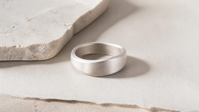
A matte silver surface is a deliberate finish. Its fine texture scatters light, so the form reads through a soft tonal shift instead of a sharp reflection. Over time, contact points may become smoother and slightly brighter. This is normal surface wear, not necessarily a failure of the finish. The design question is whether that gradual shift still supports the object’s silhouette.
Darkened recesses can make a relief or edge easier to read; broad matte planes keep the effect quiet. The strongest pieces use both sparingly. Too much blackening can turn detail into theatre, while a perfectly uniform grey can flatten a form that needs depth.
The finish also changes the scale at which an object is read. A polished edge may announce itself from across a room. Matte silver usually asks the viewer to come closer, where a curve, a small bevel or the transition into another material becomes apparent. That closer reading is useful for a substantial ring: its presence comes from contour and proportion, not from a bright, industrial-looking surface.
Wood brings variation at a human scale
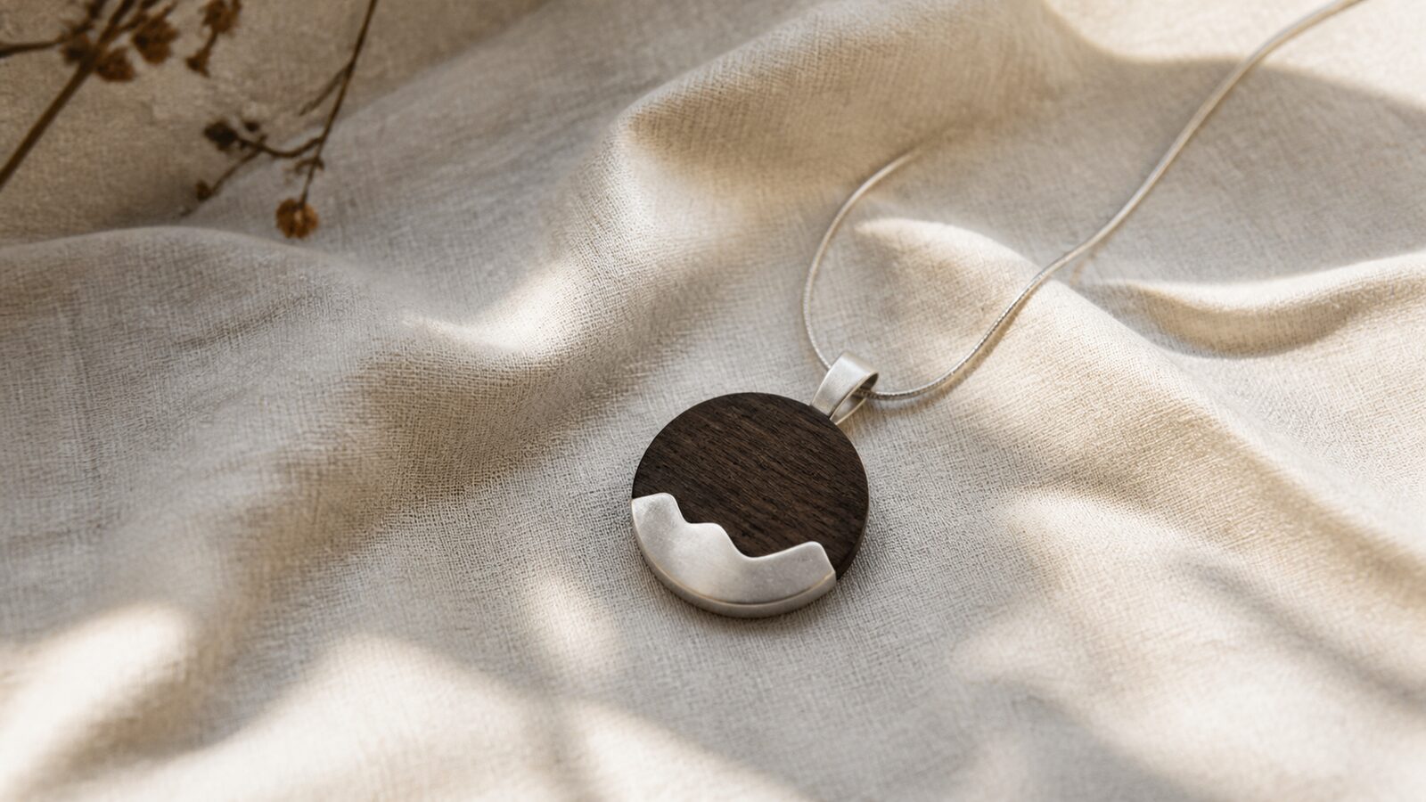
Wood introduces a pattern that is organic but not decorative by default. A restrained grain can soften the precision of silver. A more pronounced grain can become the focal point. The right balance depends on proportion: in a small pendant or ring, a modest area of wood often works better than a large block that asks the wearer to read the object as furniture.
Colour matters too. A mid-to-dark wood can sit comfortably against matte silver when the transition is clean and the form has breathing room. This does not require a story about the exact species or place of origin. It is enough to acknowledge the visual fact: grain changes from piece to piece, and that variation is part of the material.
Contrast works best when each material has a job
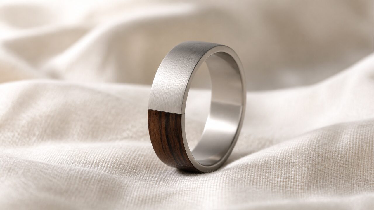
Rather than treating silver and wood as equal decoration, give them different roles. Silver can define the edge, structure and point of contact. Wood can occupy a protected plane or soften the centre. A darkened line between them can clarify the join, but it should not pretend to be a mechanical seam if it is only a visual boundary.
- For the eye: use contrast to separate planes, not to add noise.
- For the hand: avoid abrupt transitions where the object repeatedly contacts skin.
- For longevity: keep the wood away from unnecessary water, solvents and harsh polishing compounds.
How the pairing changes with wear
Silver and wood do not age at the same rate or in the same way. Silver can tarnish when exposed to sulphur-containing compounds; a matte surface can also smooth at high-contact areas. Wood responds to moisture, light and handling, especially if its finish is light or porous. Neither change has to be hidden, but neither should be romanticised into a promise that every mark will improve the piece.
Because the materials age differently, handling should be chosen with both in mind; if a joint, setting or finish looks compromised, professional assessment is safer than home experimentation.
Choosing the right amount of variation
Variation should feel local. A slight difference between the face and edge of a ring is easier to live with than a surface covered in competing marks. A small patch of wood can be enough to change the temperature and rhythm of a design. If the grain, oxidization and silhouette all demand attention at once, the piece has lost the pause that made the pairing useful in the first place.
This is also why mixed materials benefit from uncluttered settings. The silver needs enough area to establish the form; the wood needs enough edge protection to read as an intentional component. A clean boundary does more than a collection of artificial grooves, tool marks or symbolic details.
A material conversation, not a costume
The appeal of this pairing lies in contrast held under control. Silver gives the composition an edge; wood interrupts that edge with warmth and irregularity. When the proportions are right, the object feels considered before it feels decorative.
References
- Canadian Conservation Institute: Basic care—recognizing metals and corrosion products — supports basic tarnish and gentle-cleaning guidance.
- Canadian Conservation Institute: Care and Cleaning of Unfinished Wood — supports cautious care around porous wood surfaces.
Frequently Asked Questions
It can develop smoother, slightly brighter contact points. That is normal surface change, not automatically a defect.
The materials play different visual roles: silver can define structure while wood introduces grain and warmth.
Avoid unnecessary water and harsh cleaners, and seek advice if a join, setting or finish looks compromised.